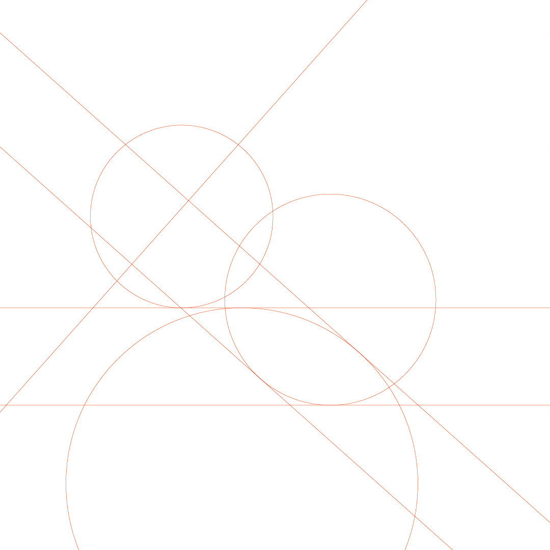
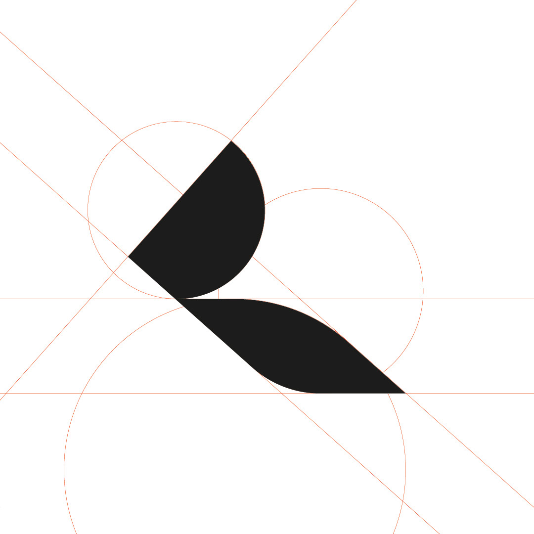
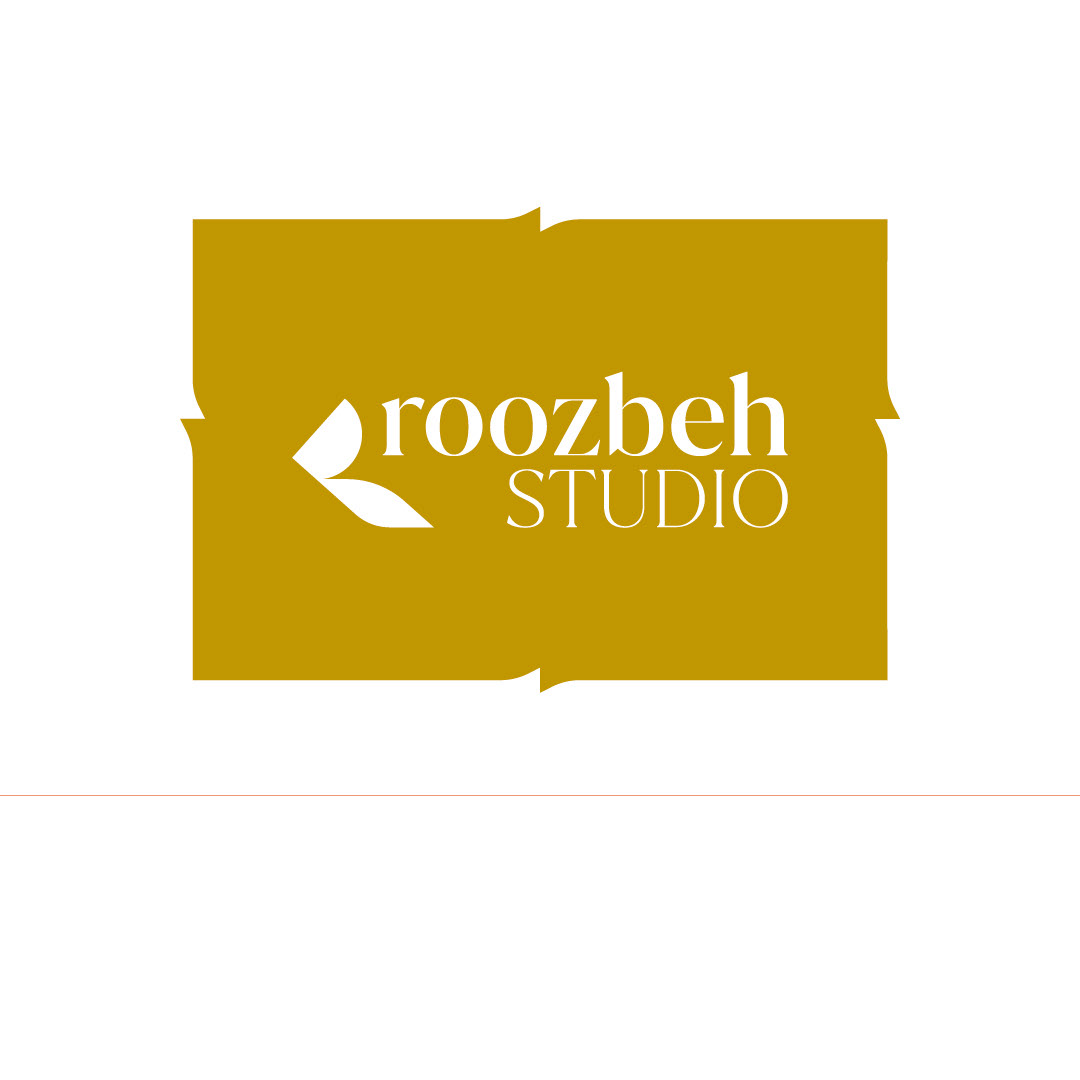
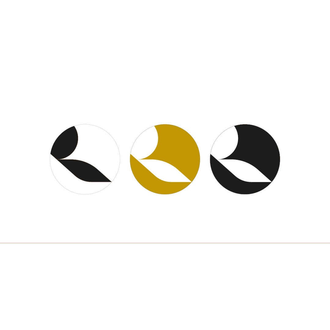
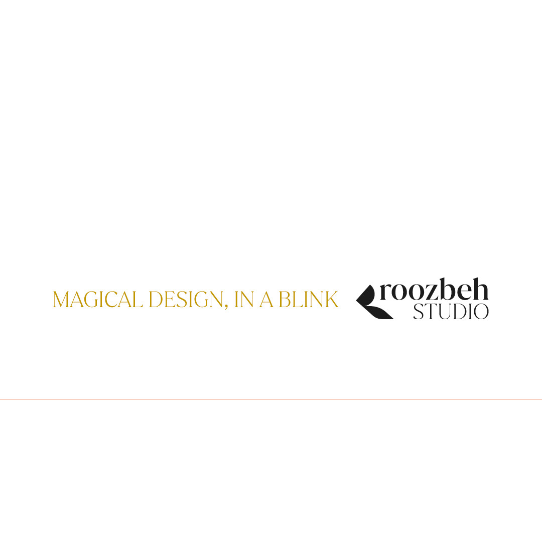
Most of the time, I use a combination of opposites in logo design. When I use this method to reach the final result, the work becomes more attractive to me. By combining soft lines with sharp and angular lines, I created a unique design for the letter “R” in the logo of "Roozbeh Studio".